Design system
OpenFief's look and voice: the marks, the tincture palette, type, components and Kasztan the mascot, and the rules for using them on the docs site and in the built-in UI.
Everything OpenFief shows people (the docs site, the landing page and the built-in UI) draws from one design system. Its files live in design/, and this page is the rule book for them. The author chose this direction; the parts marked (P) are Claude Code proposals awaiting the author’s approval.
Concepts#
The metaphor is the product. A fief is land a lord grants a vassal on conditions, taken back when they break. OpenFief’s visual language follows that feudal deal and nothing else: a gate the agent’s orders pass through, a carved-out corner of a shield for each lease, a seal for the owner’s approval, and a drawbridge for the kill switch. When the metaphor gets in the way of a plain label, the plain label wins.
Puszcza, the Polish forest. OpenFief is built for Polish investors first, and the palette and mascot come from Białowieża: a royal hunting forest whose żubr (European bison) Polish kings put under crown protection in the 16th century. The żubr lives inside a guarded domain under rules it can’t argue with, which is exactly what an agent’s fief is. The żubr is also a heraldic charge already: the Pomian coat of arms carries a bison’s head.
Tinctures, and the rule of tincture. Heraldry names its colors tinctures and splits them into metals (or, gold; argent, silver) and colors (vert, gules, sable). Its oldest rule says never put a metal on a metal or a color on a color. That rule existed so a shield could be told apart across a battlefield, and it is a contrast rule. The tokens keep both the names and the rule: gold and silver go on vert, sable or gules, never gold on a light ground.
The marks#
| Mark | File | Means | Use for | Smallest |
|---|---|---|---|---|
 Gate | gate.svg, gate-reversed.svg, favicon.svg | OpenFief itself: the gateway every order passes, with the fief, in gold, inside its arch | Wordmark lockup, favicon, navigation, anything that names the product | 16 px |
 Seal | seal.svg, seal-reversed.svg | The gate on the shield: the gateway acting for the owner | App icon, docs hero, approval requests, stickers | 32 px |
 Canton | canton.svg | One fief: in heraldry a canton is the square set apart in the shield’s upper corner | The glyph for a lease in the UI: fief chips, fief cards. Grey when revoked | 14 px |


- The Gate is the logo. The Canton is never used as the logo, and the Seal never below 32 px, where its gate turns to mush.
- The wordmark is
openfief, lower case, in the display face at weight 800, to the right of the Gate, which is as tall as the word’s cap height plus descender. - Keep clear space of a quarter of the mark’s width around it. On a dark or vert ground, use the reversed file.
- The square inside the gate is always gold. It is the one fixed point of the brand.
Icons#
The icons in design/icons/ draw OpenFief’s parts in diagrams, on the landing page and, later, in the UI. They are drawn like the marks: on a 24 px grid, with a 2 px stroke and square joins. Strokes are currentColor, so an icon takes the color of the text around it. Gold appears only where it means what it means in the marks, the fief or the owner’s seal: the gate’s square, the canton, the seal’s center, the bond’s rosette and the agent’s eyes, since an agent holds a fief.
| Group | For | Icons |
|---|---|---|
| OpenFief’s parts | the core, its operator and proxy, the plugin kinds, and the walls between them |  gate  operator  egress  connector  view  agent  wall  route |
| The money | what the record holds and how it is valued |  ledger  chart  fx  bond  statement  database  fief |
| People and the outside | who and what OpenFief talks to |  owner  browser  script  phone  institution  globe |
| Trust and control | signatures, credentials and the levers that stop things |  seal  key  secret  image  cluster  clock  killswitch |
- An icon labels a thing; it never replaces its name. Every icon in a diagram or a card has its text next to it.
- One icon means one thing everywhere. The
gateis OpenFief’s core, as the Gate mark is OpenFief;connector,viewandagentare the plugin kinds;institutionis any bank, broker or data publisher. - In a Mermaid diagram, an icon is a node shape from the pack
fief, which the docs build registers from this folder:core@{ icon: "fief:gate", form: "square", label: "Core", pos: "b", h: 40 }. Use them for diagrams of parts and how they connect; diagrams of code stay plain (Documentation). - A new icon is one more file in the folder, on the same grid, with a
<title>. The docs build picks it up by its file name.
Color#
Tinctures are the palette; components use the semantic tokens built on them, so dark mode redefines only those. The values live in tokens.css, the only place a hex code is written.
| Tincture | Token | Light | Dark ground | Role |
|---|---|---|---|---|
| Vert | --vert | #1E3A2B | #3F7A5A (--vert-bright) | The brand: primary fills, the hero, current page |
| Or | --or | #C99A2E | #D9AE4A (--or-bright) | The fief: the gate’s square, the canton, the seal, focus rings |
| Gules | --gules | #B4232A | #E0575C (--gules-bright) | Revoking, cancelling, errors |
| Kasztan | --kasztan | #8A4B2A | The mascot’s coat; small labels and eyebrows | |
| Sable | --sable | #14171A | Text; text on gold | |
| Argent | --argent | #F3F4EF | Light ground; text and marks on vert |
Semantic tokens, by job: --bg, --surface, --sunken for grounds; --text, --muted, --border for content; --accent and --on-accent for the primary action; --highlight for gold fills and --highlight-text for the rare gold text; --danger and --on-danger; --link; --label for small uppercase labels (kasztan, lightened on dark); --focus; and a soft background with its text color for each status (--ok-*, --warn-*, --danger-*, --neutral-*).
- Body text meets WCAG 2.1’s 4.5:1 contrast, small grey labels included. Gold (
--or) on a light ground is about 2.5:1, so it is never text there. - Status is never color alone: every pill carries a word, and an icon when it matters (verified, unverified).
- Dark mode follows the reader’s system setting. A page can force one scheme with
data-theme="light"ordata-theme="dark"on<html>.
Type#
| Role | Family | Weights | Token |
|---|---|---|---|
| Display: headlines, the wordmark, empty states | Bricolage Grotesque | 700, 800 | --font-display |
| Interface: everything read and clicked | IBM Plex Sans | 400, 500, 600 | --font-sans |
| Figures: amounts, quantities, IDs, code | IBM Plex Mono | 400, 500 | --font-mono |
- The fonts are self-hosted in
design/fonts/, loaded byfonts.css, with Latin Extended so Polish names render. All three are under the SIL Open Font License 1.1, whose text sits beside them. Nothing loads from another host. - Amounts are always monospace with tabular figures (
font-variant-numeric: tabular-nums), so columns line up, and always show their currency, because every amount keeps its original currency (D-20). Write them in the owner’s number format (D-113), whose Polish default is5 000,00 PLN. - Headings are tight (
letter-spacing: -0.02em), body text is 16 px at 1.6 line height, and lines stay under about 75 characters.
Space and shape#
- Spacing steps on a 4 px base:
--space-1to--space-7are 4, 8, 12, 16, 24, 32 and 48 px. Lay out sibling groups with flex or grid and a gap. - Corners are near-square, like a shield’s edge: 2 px for inputs, 6 px (
--radius) for cards and buttons, and fully round only for pills. - Touch targets are at least 44 px. Focus is a 2 px
--focusring with a 2 px offset, never removed. - Motion is limited to state changes, under 200 ms, and off under
prefers-reduced-motion.
Components#
The pattern library, as drawn. M0 needs only the first group; the rest belong to the agent milestones and are not built (M1 and later).
M0, tracker and built-in UI (UI):
- Buttons. Primary:
--accentfill,--on-accenttext. Secondary: 1.5 px--accentoutline. Quiet: underlined text. Destructive:--dangerfill. One primary per view. - Status pills. A plugin’s trust badge (D-56, D-87): Verified (ok, check icon), Yours (neutral), Unreviewed (warn), Blocked (danger, cross icon), with the exact signer under it. Valuation state (D-36): Revaluation pending or running (neutral pill with a gold dot), and valued through a date in monospace.
- Tables. Holdings and transactions: monospace, right-aligned figures; a sunken header row; no zebra stripes. Wide tables scroll inside their own box on a phone.
- Inputs. A label above every field, a 1.5 px
--border-strongborder with the 2 px input radius, a currency suffix inside amount fields, and help text under the field in--muted. - Charts. The allocation and value-over-time charts (D-30) use vert, then or, kasztan, a grey and the vert tint, in that order, with direct labels where they fit.
- Empty states. Kasztan asleep, one line saying what’s missing, and the action that fills it.
Later, agent surfaces (not built):
- Fief card. The canton, the agent’s name and thesis, an Active or Revoked pill, a meter of the lease in use split into holdings and open orders, and the lease’s rules as chips.
- Approval request. On the owner’s phone: the seal, the proposed order, the agent’s “wrong if” condition, the gateway’s checks (within lease, rules pass, separate account), and Reject beside Seal it.
- Kill switch. A sable panel titled Raise the drawbridge, saying what revoking does, with a
--dangerbutton that names the agent. Hold-to-confirm for two seconds (P).
Kasztan, the mascot#
Kasztan is a żubr in a castellan’s gold chain of office. A kasztelan kept a castle and its rules for the crown; kasztan is also Polish for chestnut, the color of his coat. He appears in four poses, one per system state:
| Pose | File | Shown when |
|---|---|---|
 On duty | kasztan-on-duty.svg | Sign-in, about, the landing page: everything is normal |
 The seal | kasztan-seal.svg | Success: an approval went through, an import finished |
 Drawbridge | kasztan-drawbridge.svg | A fief was revoked, or something needs the owner now |
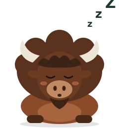 Asleep | kasztan-asleep.svg | Empty states: no accounts, no fiefs yet |


- Kasztan appears in empty, success, error and onboarding states, at most once per screen. Never in a data table, a chart, or next to a loss.
- Place him on
--argentor--sunken; the poses are drawn for a light ground. - The poses are a flat-vector draft. A final illustration should keep the proportions, the chain and the four states.
Voice#
- Plain first, feudal second. Data views use the glossary’s terms exactly: holding, not position; instrument, not ticker. The feudal words (gate, seal, drawbridge, charter) go in headings, empty states and the landing page, never in place of a domain term.
- Say what happens, with the consequence: “Revokes trading rights and cancels open orders. The rest of your portfolio is untouched.”
- No exclamation marks in the UI, and no emoji. Kasztan carries the warmth.
How it works#
design/ is the single source; the docs site and the built-in UI consume it and never copy a value out of it.
- Hugo mounts
design/twice (site/hugo.toml): into the assets, wherehead.htmlconcatenatestokens.cssbeforesite.css, and into the static files under/docs/design/, which serves the fonts, the favicon and the images on this page. So this page’s images work both on GitHub and on the site. - The site’s own stylesheet uses only semantic tokens. The Gate in its top bar is inline SVG (
mark.html) incurrentColorwith a gold square, so the content security policy needs no image source for it. - The built-in UI serves the same files.
design/design.gois a Go package with one embedded file system holdingtokens.css,fonts/,marks/andmascot/at their own paths, because Go’sembedcan’t reach files outside its package’s directory. The UI serves it under/static/design/, and every page loadsfonts.css, thentokens.css, then the UI’s ownstyle.css, which uses only semantic tokens. Nothing is copied, so there is no copy to drift; the UI’s image build copiesdesign/next tointernal/, and Hugo’s mounts leavedesign.goout of the site. The Gate in the UI’s top bar is inline SVG, as on the site; Kasztan and the favicon are images from the same files, which the UI’s content security policy allows as its own (img-src 'self',font-src 'self'). - The UI’s charts take their colors from the tokens at runtime:
style.cssmaps the five series onto semantic tokens (--series-1is--accent, then--highlight,--label,--border-strongand--accent-soft), and the chart script reads them as computed CSS custom properties, so the charts follow light, dark anddata-theme, and redraw when the reader’s scheme changes. Tests indesign_test.gofail on any color written outsidetokens.cssin the UI’s templates, scripts or stylesheet, on a custom property the stylesheet uses that nothing defines, and on a page that doesn’t load the design system. - Mermaid diagrams render in the same palette:
docs-diagrams.mjspasses a light and a dark set of tincture-based theme variables, and registers the icons as the Mermaid icon packfief, swapping their gold for--or-brightin the dark rendering. The landing page inlines its feature icons, so they take the text color. The built-in UI doesn’t use the icons yet, sodesign.godoesn’t embed them.
Not built yet#
- Direct labels on the UI’s charts. Chart.js draws none without a plugin, so the value-over-time chart names its two lines in a legend, and the allocation’s bars are labelled on their axis.
- The agent surfaces above wait for their milestones.
- Kasztan’s final illustration.